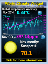
The largest temperature spike in the middle of the graph is for 1998.
Please note that the abbreviation 'ppm' is parts per million. So 390.58 is the equivalent of 0.039 percent of the atmosphere.
----------------------------------------------------------------

Click on this image to get your own widget for your blog's sidebar.
... or just copy all of this html code :-
[a href="http://wattsupwiththat.com/widget/"][img alt="Click to get your own widget" src="http://cache4.intelliweather.net/wcw/world_climate_widget_sidebar.gif" title="Click to get your own widget" width="166" height="223" /]
(Change all of the bold brackets to angled brackets.)
You could increase the width to 332 and height to 446 to get an image that is twice as big -- but the resulting image is a bit fuzzy. As can be seen further down this page, in the right-hand sidebar.
-----------------------------------------------------------------
The GW theory primarily says that when you get increased levels of the minor atmospheric gas CO2 you should also get an increased average global temperature.
.


1 comment:
Awesome bllog you have here
Post a Comment